HubSpot Platform Design
Password Protected
This case study is password protected due to the recency of this information. To read this case study, enter the password.
If you don't have a password, please contact me to request it.
Sense for Staffing
Contents
Design system ownership, creation, & rollout


During my three years designing for Sense, the company has rocketed to over $40 Million in revenue, a growth of over 6x. But to generate that growth, it was necessary to take on a large amount of design and tech debt. Customers benefited from many new products and features but suffered from an inconsistent UI style that was a remnant from the earliest days of the startup.
Series D funding allowed me to push Sense to build a design system (hover over image). This not only modernized and revitalized the UI and brand, but most essentially it increased the velocity of the design and engineering teams. The value of design systems is well documented, but every company considering a design system faces the great challenge of turning the wheel of a massive moving ship, marshaling resources, and managing change for customers.
I left Sense before the project was completed, but this case study covers how I was able to generate consensus during this herculean project.
From advocacy to initiative
As the most senior design leader on the team, I played several key roles in kick-starting this initiative and ensuring its success over multiple years. From my first month at Sense in 2019, I began advocating for design system adoption. I wrote proposals about its benefits and its costs. I presented multiple UI designs for the potential new look and feel, and I got feedback from customers during qualitative research. But my advocacy wasn't initially successful. The turning point came when I partnered with engineering. I found enthusiastic front-end developers who worked with me to take our message to both product and engineering leadership. Even before new funding came in, together we were able to kick-start the project officially.
Implementing a design system has larger impact — and therefore requires more consensus building — than almost any other product change. Any design system must be highly functional, follow careful logic, and appeal to well studied use cases. Despite this, what's most visible to stakeholders is largely the aesthetics, such as fonts, colors, shapes, and shadows. All stakeholders have valid opinions about such aesthetics, so how can design leaders help them find common ground?

Like most design projects, I began with comparative analysis. Sense is a SaaS enterprise automation tool, and users expect a familiar UI that reminds them of similar SaaS tools. I was able to present to stakeholders the similarities and differences that I found between those competing tools. Yet that still allowed for several possible aesthetic directions, and we were hampered by bike shed
concerns such as which corner-radius best matched our brand. I made the case to the head of product that we were beginning to spin our wheels.
A breakthrough came when I suggested that I had past success during in time at Blackhawk Network in utilizing a contract design firm. I had discovered at that time that an external firm is perceived as more unbiased and expert, relieving some of the decision making pressure from internal stakeholders. We were able to find a firm that was recommended by one of our venture partners, which gave them enough clout that we were able to take their aesthetic recommendations and move forward. I coordinated their efforts to create several design styles, color palettes, and font pairings. I led the critique of their designs and gathered feedback from stakeholders (scroll image).
From style guide to atomic components

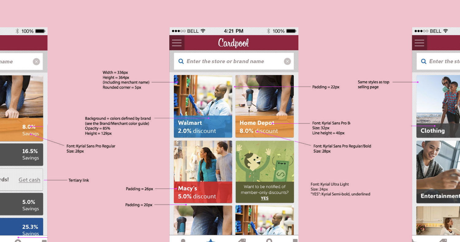
After I secured internal agreement on the style guide created by our contract firm, I began the work of articulating a visual language and reworking those styles to bring them into consistency with that visual language. What will different colors signify to users? How can we provide visual affordances and clues to users about which elements are interactive? What visual aspects unify the functionally similar components in the minds of users? (image)

Having documented this visual language, the next step was to create reusable atomic components using our design tool of choice, Figma. Figma allows components to have variants
, for example a single button component with a variant for default, hovered, and disabled states. As the owner of the design system, I carefully crafted hundreds of variants of the core atomic components, ensuring their consistency. I also baked in their animations and interaction patterns, allowing the other designers to simply drop the components into their design files then choose the appropriate variant.(image)
Pressure testing
Though I owned component design, I relied on my two fellow design team members to pressure test the components by including them in their prototypes. This highlighted subtle weaknesses. For example, they pointed out that my initial styles for disabled elements had too much visual weight. I also decided to create informal contests within the design team to create infrequently used components, such as our slider and file-upload input. This not only led to more creative options, but gave each designer the pride of having their name on a concrete piece of the system.(image)

Meanwhile, I partnered with engineering as they authored the code-components to be used within the engineered product. This also pressure tested my earlier design decisions. The engineers encouraged me to be ruthless about keeping the number of variants low and essential. Avoiding variants for every corner-case both reduced the code engineers needed to create and maintain and reduced risk of design inconsistencies.
Implementation & Launch
How should we guide users through the potentially shocking transition from old to new? How do we take on the gargantuan task of migrating every page and feature to the new design and code? In what order should we make that transition, and should we continue to update features that haven't yet been migrated, adding to our tech-debt?

The answers to such questions are unique to every organization. As the owner of the design system on the design side of the organization, I worked most closely with my counterpart design system owner on the engineering side. I also worked with stakeholders to align on those critical decisions. I documented many paths that we might take, including their benefits, costs, and risks. For example, should we allow users to toggle between new and old, as other products have chosen to do? That choice would add considerable costs, but greatly mitigate user confusion and resistance to change. We ultimately decided to use my option of doing a low-cost facelift
on all existing pages, which made them feel closer to new pages that were build on the design system.(scroll image)
Road blocks
Some stakeholders argued that their own products needed separate design systems. They made the quite reasonable argument that different users may need different component behavior, just as different users sometimes need different branding. In particular, Sense had separate brands for its B2B and B2B2C users, who are very different personas. Additionally, some of our B2B users required a greater density of on-screen information than others. While reasonable, these arguments threatened to slow our momentum or even send us back to the drawing board.
Fortunately, I had prepared for these roadblocks in advance. Sense is hardly the first company to implement a design system, and we didn't need to re-invent the wheel. I found blog posts describing the pros and cons of creating multiple systems, creating specialized component variants for different users, and simply using the same components for all users.
What we learned
I knew that design systems were living, but I was surprised by how quickly ours needed to adapt and evolve. Implementing strict versioning has been helpful. Every new page we built brought new questions about whether macro UX patterns, such as the layout within our side-panel, should be codified or left to designers' discretion. I have been surprised to find my fellow designers falling on both sides of this question at different times. On the one hand, they craved freedom to express themselves and chafed at shoehorning their designs into the system rules. On the other hand, they empathized with our users' need for consistency, and they enjoyed the challenge of finding rules that worked for every situation.
Moving from ad-hoc design & code to a formal system required a sea change for the design team, in terms of process, as well as re-architecture of the front-end code base from the ground up. That's why, as soon as I started advocating for the project, nearly three years earlier, I made sure that stakeholders understood that we wouldn't just be putting on a new coat of paint
.
Just as design systems deeply impact product development process, its impact on me was a shift in focus towards infrastructure, change management, and team dynamics. For example, before the design system, there was of course never a need to check designs for alignment to the design system! We needed to invent formal processes for doing that. Meanwhile, our critiques changed focus to function above form, since form was largely baked in. I also reworked our hand-off to engineering. Over time, my role at Sense shifted further from nuts-and-bolts UX design towards process-design, documentation, and leadership.

Ensuring progress after my departure
Sense's new design system was only part way through its rollout when I left the company. However, I already saw huge benefits to design and engineering teams' velocities. During my tenure, I was careful to create the documentation that would guide future designers, such as examples of design do's and don'ts
. We also hired more team members over those three years, so I was able to oversee delegation to and training of more junior designers.
Platform Overhaul — Codename Project 2.0
Summary
I owned the project to redesign Sense's flagship product, the messaging & database automation platform that unifies Sense's entire product suite. This overhaul, code named Project 2.0
, incorporated a completely new information architecture, all new UX patterns, and the new design system (see above). The project began with the realization that the product suite had grown so large & diverse that most customers weren't using it to its full potential. Often customers who found great success with a small part of the suite didn't discover or utilize its other parts. Customers were overwhelmed, and their reliance on white-glove support wasn't scalable.
Though I had been working on the project for two years, the only engineering that has begun was the data-structure to support the planned new features. That long research and discovery phase was completely appropriate for the massive investment in company resources that were required. However, we couldn't have and didn't kept customers waiting for new features during those two years. Throughout my Project 2.0
discovery processes, I also designed and launched several smaller features.
Each of those smaller launches revealed pivotal insights for the design of the larger Project 2.0
. In fact, they often changed my assumptions about the entire goal of the larger project. These insights are highlighted below.
Side Project: Automations Organizer
Background
Sense recruiting tools allow users to send a series of automated messages to candidates and to use their responses to make automatic database changes. Customers typically create dozens of such automations, but originally customers could only access them via a simple list with basic filtering. They needed a tool to organize and search within their automations. (see image)
What we built

When I conducted user interviews, multiple users stated that they simply wanted to place automations into folders or to apply tags. When I studied hundreds of customer automation names, I found similarities in their ad-hoc naming conventions. I discovered that some savvy users had created a crude tagging system by writing tags
into the automation names. For example, they embedded their client's names, branch location names, and type of message recipients into the automation names. I used this information to design an organizer-tool with a tagging UX that included a recommended tag naming convention. Also, since we could automatically determine some meta-data about each automation (e.g. a message's recipient type), I exposed that meta-data in the designs and made it filterable. This alleviating the need for users to manually create certain tags (e.g. tags for message recipient type).
How that side-project informed Project 2.0
The research revealed that customers didn't know how they should group messages to be automated. Some created dozens of automations, each containing only a few messages. Others created only a few automations, each containing dozens of messages. While both of these groups were helped by the tagging system and satisfied that Sense had given them what they asked for, that new organizer-tool failed to solve a fundamental issue:
Users were treating automations as equivalent to folders
— filling them with loosely related messages rather than a sequence of messages that accomplished a discreet goal. In fact, the new tool encouraged an incorrect mental model that limited how customers used their automations. Therefore, I realized that the focus of Project 2.0 needed to shift to helping users create a better mental model.
Side Project: Message Scheduler-tool
Background
A Sense automation can contain any number of messages to candidates. Each message has complex rules for how it is triggered and scheduled. This scheduler-tool contains many options that were added over years to meet customer requests and edge cases. Eventually, the interactions between those many options become nearly impossible for users to understand. For example, schedules can be based on dates that are static or relative to database fields, including arithmetic adjustments. They can recur in complex intervals and change based on the time-of-day and day-of-week.
What we built

When I discovered this issue during user interviews about an unrelated feature, I convinced my PM partner to prioritize a project to overhaul the scheduler-tool. Midway through the project the original PM left Sense, and in the months before their role was refilled, I took on the responsibilities of coordinating with engineering to make sure the project was completed.
The project strategy was to create a new front-end UX that would reorganize and regroup the many options within the scheduler. I started by creating a tree-map of every possible combination of options. To my surprise, not only did I not understand the effect of some combinations, no one at the company understood them! In fact, some of the allowed combinations in the UX were logically impossible. After solving these issues, I created a functional prototype to test with users. This revealed the two distinct needs for the new interface: Firstly, users needed a form that exposed all of the potential values of the many options. These needed to be concise and compact to make them easy to adjust. Secondly, users needed an explanation of the result of their selected options on the messaging schedule. Unlike the form's need for brevity, this explanation needed a verbose sentence format so that the schedule was sure to be human readable and fully understood by users. (scroll image)
How that side-project informed Project 2.0
The new scheduler I championed was highly successful at improving our KPI of having fewer customer questions sent to customer service. It was also validated as successful by a post-launch satisfaction survey. Yet, while customers were better able to schedule each message within an automation, the project exacerbated a critical issue with automations themselves:
Because each message had a separate set of scheduling options, we encouraged the wrong mental model for automations. Users treated messages within an automation as independent rather than part of a sequence with a larger goal. Again, this side-project validated the importance of helping users create a better mental model for Sense's product suite as a whole.
Side Project: Template Automations
Background
The issue of customers not fully utilizing Sense automations was caused, in part, by customers not understanding all of the product suite's capabilities. We knew that a time-tested way to educate users and reduce their workload was to provide them with pre-built, plug-and-play automations designed to solve common use-cases and to follow best-practices.
What we built

Since templates are common to many products, the UX patterns I chose made heavy use of my comparative research of other marketing and messaging automation platforms. I partnered with our sales and customer service teams to determine the most common customer use-cases that we could productize into template content. During this internal research, I discovered that the customer service team had already created offline templates that they stored as text in Google Docs. They had been building automations for some customers as a white-glove service. I organized and standardized these documents to create the starting point for the team that authored the template content.
While I was in the discovery phase of this project, Sense had a hackathon, and I knew an engineer who was enthusiastic about it. They wanted to try their hand at UX design, so I shared my research findings with them and encouraged them to use the findings to decide on UX. I treated them as a junior designer, giving the engineer wide latitude to learn. Together we created a working MVP of the new template tool that won the popular vote hackathon award. This resulted in the head of product re-prioritizing the templates project, moving it to the top priority for the next quarter.
How that side-project informed Project 2.0
Unfortunately, in building the releasable version of this new feature, we ran into severe technical constraints. Templates needed to contain variables, such as recipient names, but different customers used different custom database entities for those variables. Therefore, in an effort to reduce scope and launch sooner, we decided to remove some variables from the templates rather than build an automatic process to insert the appropriate database entity for each variable and each customer. Unfortunately, that was the wrong decision.
Deciding what can be cut for an MVP is always difficult, but in this case, we made the wrong cuts. We forced customers to manually fix templates in order to use them, which lost the plug-and-play benefit that was one of the core user-stories behind the project. The result was low adoption.
Conclusions for Project 2.0
— The importance of user mental models
I began the discovery phase of Project 2.0 with the goal of re-organizing the automations product to reduce cognitive overload, expose the full capabilities of the product suite, and track the degree to which customers utilized the suite. The successes and failures of the side projects described above changed my strategic approach to Project 2.0 considerably along the way.
I learned that users had an unhelpful mental model of automations that was subtly reinforced by the product design. We missed this internally because we were biased by our own marketing and our vision of our business proposition. We weren't doing enough dog-fooding
and listening to users.
Project 2.0 would need to change users' mental modal from seeing each automation as a mere folder
of messages and database updates to seeing them a sequenced set of messages that work together to achieve a measurable goal.
What we built
My learnings from the templates project showed that cuts made for an MVP must not cut the core user stories that drive adoption. It was tempting to limit the scope of Project 2.0 to merely redesigning the UX and IA, which was a large undertaking on its own. However, discovering the core user need for understand automations as goal-driven deserved the extra expense to bake a goal-driven mental model into every page and feature. Through comparative research, I had determined that a line and node
canvas builder would be the ideal UX pattern for building automations. That would visualize each automation as a sequence rather than a disjointed list.
Meanwhile, the scheduling project revealed that we could further encourage goal-driven sequencing by detaching the schedule from each message and moving it into a trigger node
that sits between two messages. (see image) I created several iterations of working prototypes and tested them with customers. Meanwhile, I journey mapped the product suite to visualize how separate products overlap to address many use-cases. The prototypes include a new product-wide navigation, a new rule-builder for targeting recipients, a way to trigger automations based on recipient action (or inaction) to other automations, and a library of reusable user-made automation components.
Clover Task Management
Background
Clover Health is an insurer for the Medicare population. The Medicare system rates insurers based on the number of patients in each insurer's population who have chronic conditions and based on whether the insurers can prove that their patients don't experience any gaps in care
for those chronic conditions. This rating system is a strong incentive because it directly impacts an insurer's bottom-line. To improve their ratings, insurers rely on the healthcare providers within their networks to carefully document the constant and consistent care of of their patients who have chronic conditions.
My task at Clover was to design a tool to be used at doctors' offices to achieve this documentation goal. The tool would surface administrative tasks generated by Clover's back-end systems (tasks such as ordering tests for a chronic conditions and checking if patients are correctly taking medication for those conditions). The tool would then allow administrate staff members at doctors' offices to prioritize, manage, and complete those tasks. Completed tasks would then automatically create the documentation necessary to prove constant care to Medicare and thereby meet Clover's business goals of increasing their rating and maintaining healthy patients.
Product Strategy
The Challenge
If we could get doctors' offices to use the tool (hover over image), the bottom-line business benefit to Clover was clear. But what were the incentives for doctors' offices to actually use the tool? My first strategic challenge was to ensure that Clover's executive stakeholders understood the paramount importance of motivating — not just the owners and managers of doctors' offices — but also the end-users, the administrative staff members who I would be building interfaces for. As the advocate for the end-user and expert in their needs, it was essential for me to communicate the difficulties of getting end-users to remember to engage with our tool and to understand the what's in it for me
of using our tool.
The Environment
I conducted many qualitative interviews with these administrative staff members, including visiting their offices during working hours to understand the unique environment in which they would use the tool. It's all too easy for product managers and designers to assume that software will be used in an environment similar to that in which they were created: a quiet office, state-of-the-art equipment, and perhaps with snacks and beverages close at hand! Through visiting these offices, I found a very different story: a hectic and distracting environment filled with patients calling out in distress and multiple ringing phones, old and slow computers running Internet Explorer browsers, and rapidly changing priorities issued from office managers.
It's also easy for business stakeholders and designers to forget that, while their product is the most important thing in their lives, their product must fight to even be remembered by the end-users. In considering my users' environment and their incentives, I needed to remember that Clover's patients often made up a small percentage of all the patients that a doctor's office encounters in a given week. I needed to consider the users' offline activities and daily workflow, and what might trigger them to re-engage with our online product when they were not staring it their screens.
Usability Research
Exploring incentives & triggers
Using interviews and prototypes, I explored several avenues for potentially incentivizing the use of our tool. One seemingly potent avenue, initially favored by business stakeholders, was a financial incentive. Why not use a portion of the revenue generated by the tool to pay end-users directly for using it? However, this idea proved thorny. Paying administrative staff directly would add new operational overhead for Clover. More importantly, I found that the doctors' offices' owners and managers I interviewed considered this idea an interference with their own delicate systems of incentivizing their office staff. I also explored the minimum payment amount that would be effective, whether staff wanted to understand their earnings per-task, per day, etc., and whether earnings should be pooled and evenly distributed to all staff members or indeed if staff members should compete with one another over the payment pool.
Additionally, I generated many alternative ideas for potential incentives, including non-financial gifts, creating an emotional understanding of how task completion improved patient lives, incentivizing patients to send thank-you messages to staff members, and online gamification techniques. I also tested my ideas for smartphone notifications about new and critical tasks, incentivizing Clover patients to deliver personal notifications to staff members during visits, and more long-term concepts such as an electronic badge that could follow Clover patients from room to room within the office, triggering our applications.
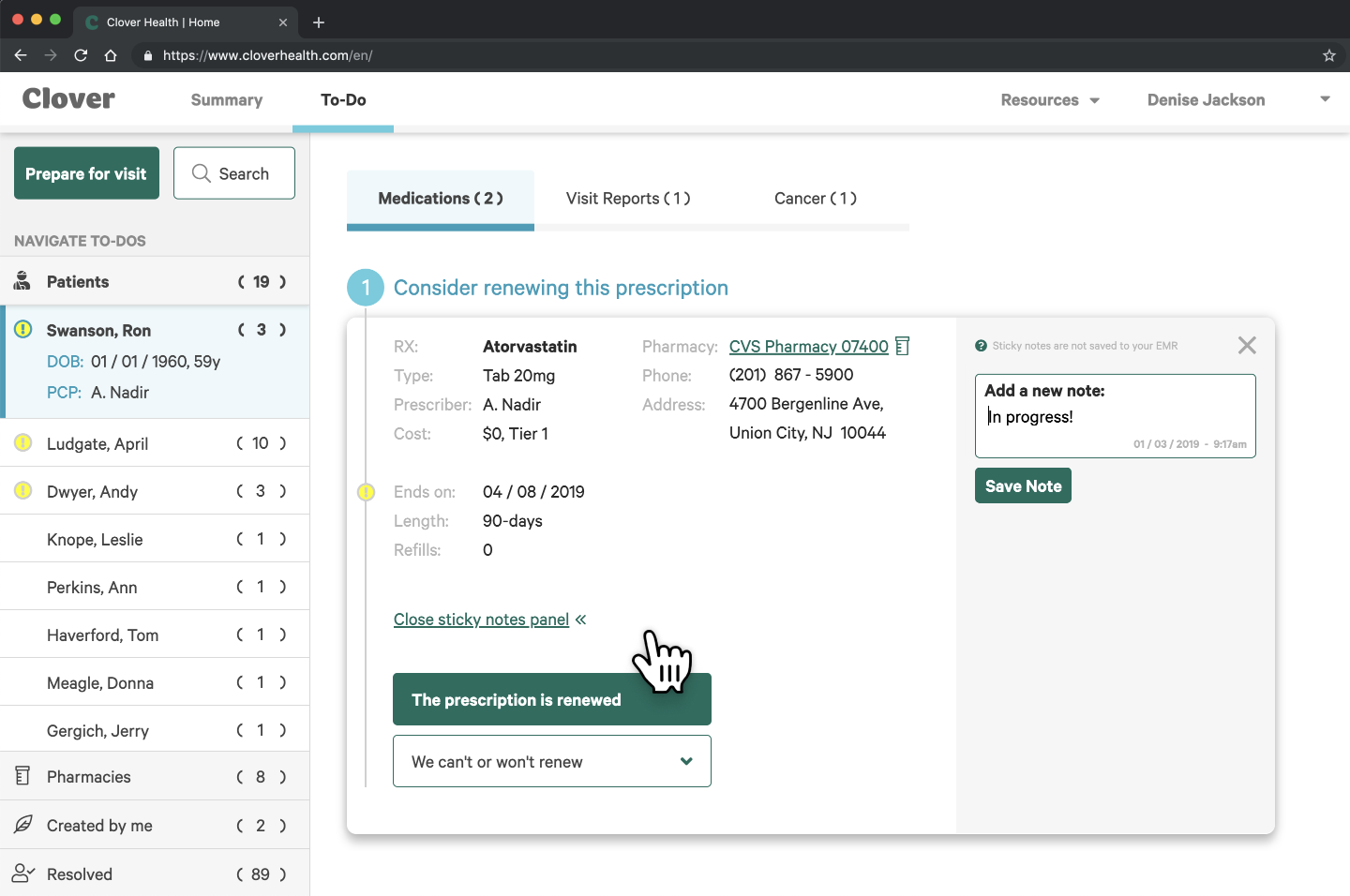
Comparative analysis
Before starting to concept designs, I first conducted extensive comparative analysis. Direct competitive analysis wasn't possible because Clover's tool was the first of its kind in its industry. I studied and documented many task management tools, including common consumer tools, and the tools of software creation task management, such as Jira & Asana. However, those tools all differ from Clover's tool in a significant way: users of Clover's tool would not generate their own tasks. Therefore, I further identified non-task-management tools to study, based on criteria such as shown in the sample slide (image).
High Fidelity Prototypes
Presenting these findings to business stakeholders and subject matter experts allowed me to proceed with prototyping the first iteration of the tool. My UX and visual designs made use of our existing design system as well as the look & feel guidance provided by user interviews.
For example, our end-users — administrative staff — were most familiar with the cumbersome and byzantine UX of electronic medical record software. However, I was able to document these users' dislike of poor UX, and make the case that modern style choices would result in better task completion. That might seem like a no-brainer, but it was a deviation from industry standards.
After validating low-fidelity prototypes with internal users, I decided to create a high-fidelity prototype in order to conduct usability tests. This would allow users to experience end-to-end interaction patterns. Additionally, I needed to prove to stake holders that animated transitions were necessary to convey meaning and guide the users' eyes from step to step (video).
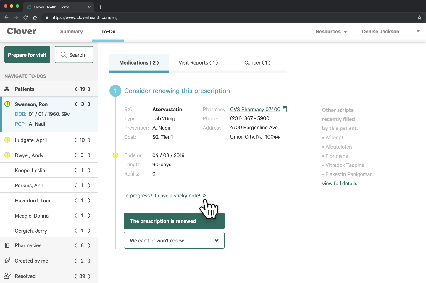
I conducted usability interviews with four users, asking them to complete usability goals such as choosing a task and marking it as complete within the tool. As usual, user feedback led to significant changes to the initial designs as well as a deeper understanding of the users' motivations and workflow. For example, while it's often better to show all available options rather than to collapse them into a drop-down menu, the single call to action we can't or won't renew
proved more readable due to the high information density of the page.
Siempo Mobile OS
Background
I joined Siempo just as it was making a major pivot away from creating a hardware phone and towards building software solutions for screen addiction. As Lead Product Designer, I was responsible for the full product stack. I designed launched the Siempo Beta app for Android within six months.
Product Strategy
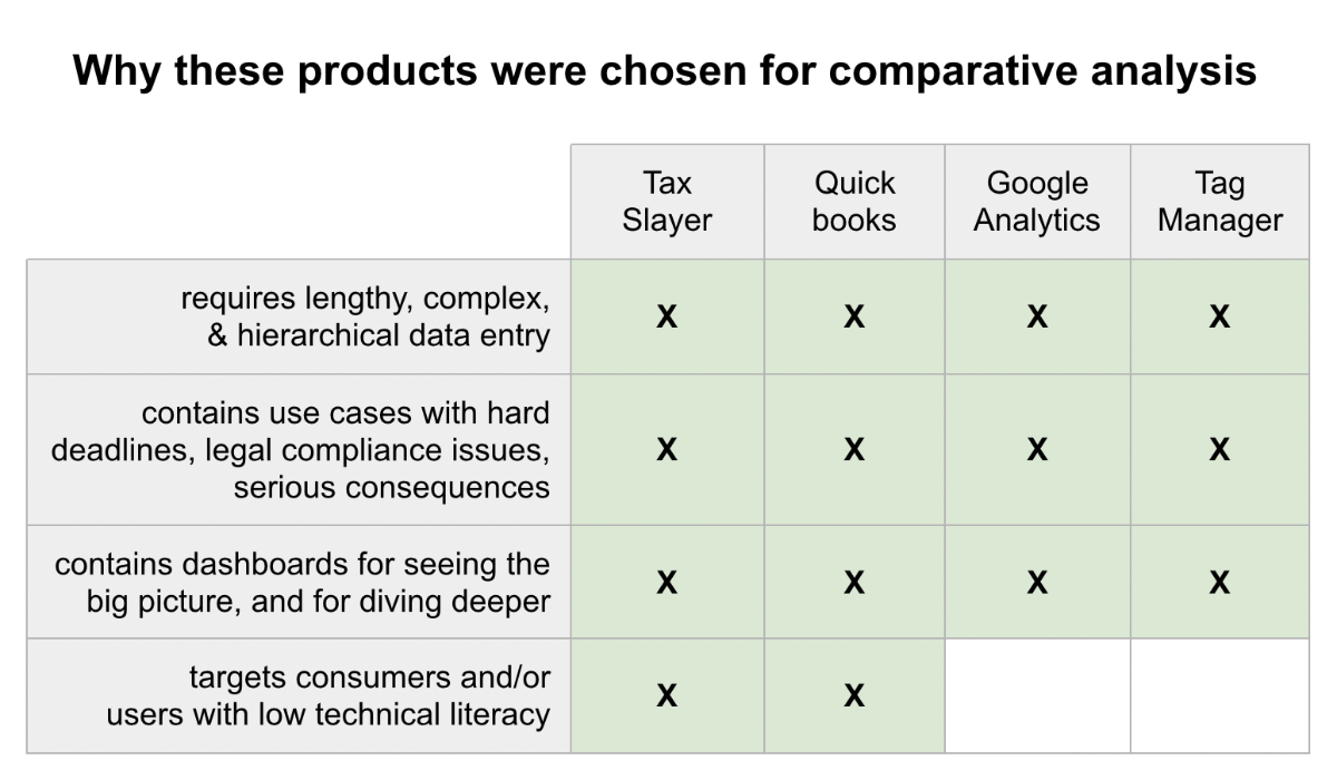
Usability personas
Because of the pivot, the future of the product was wide open when I joined. My first priority was to understand our potential users. I knew that Siempo could be useful to and needed to reach a wider range of users than just those who would describe themselves as addicts
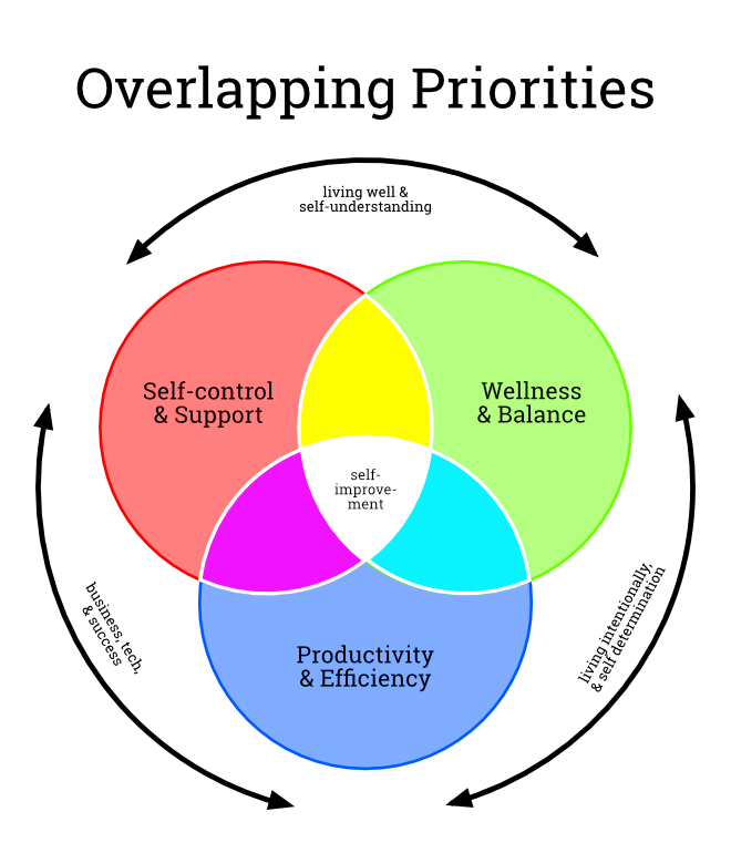
. After conducting several interviews with the founders and alpha testers, I identified three usability personas that each had very different needs from the product.
As the venn diagram shows (hover over image), users have many reasons for reducing their phone usage, or simply for using their phones more mindfully. These range from a desire for a healthier lifestyle to a desire for focus and productivity to a desire for support during moments of temptation.
Key performance indicators
I also identified the top-level KPI for measuring the success of all of the products to be built: time spent in apps that users have flagged as problematic for them. This single metric would drive consensus within the team as well as provide powerful proof of Siempo's value to its users.
UX Research
Validating the usability personas
While the personas resonated intuitively with all of the founders, I knew it was necessary to validate them quantitatively, given their long-term implications for the product road-map and the business priorities.
To do so, I designed a quantitative survey which I launched to a representative sample of the US adult population. The survey asked respondents several multiple-choice questions about their phone habits and their feelings about their phone use that could be used to bucket them into one or more of the usability personas. At the end of the survey, I also described the personas, plus a fourth persona as a control, and asked them to self-identify as one of the four.
Results
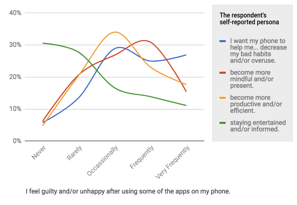
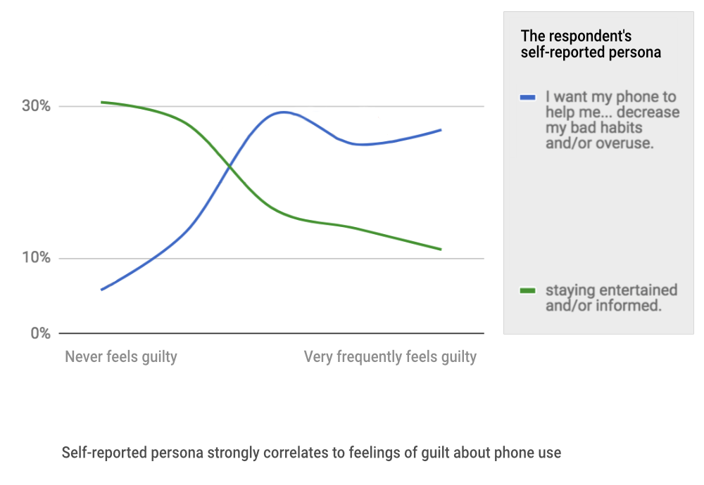
The survey results strongly validated the personas as distinct and showed that all of the personas (except the control group) had some desire for Siempo's feature set. That information gave Siempo an accurate prediction of its serviceable available market size. Additionally, by dissecting the data I found a strong correlation between a respondent's self-reported persona and the frequency of their feelings of guilt about their phone use as shown in the chart (hover over image).
Interaction Design
I designed an end-to-end prototype of the mobile app that I could place in people's hands for usability interviews. I conducted several interviews, giving each participant tasks to validate if our features were discoverable, accessible, and effective for all three usability personas. These interviews revealed many improvements that I was able to implement into the design before the start of engineering. I also created this 38 second overview of the beta app's feature set (video).
Siempo is the first app of its kind that helps curb unwanted phone habits from the moment of unlock. I researched other habit-breaking apps, addiction literature, and inverted the theories of behavior that are typically by product designers to keep users glued to their screens. I helped ideate features that eschew cold-turkey for gentle nudging while reducing the behavioral triggers that encourage unconscious app usage.
Visual & Motion
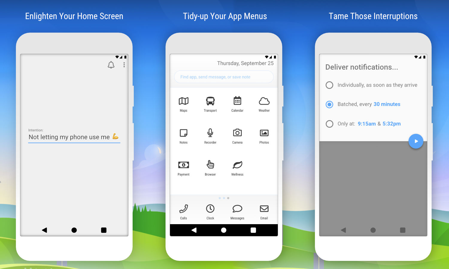
Siempo is a home app or launcher that replaces the default method of paging through third-party apps in order to launch them. Because Siempo's purpose is to help users reduce their screen time, my visual design of the app needed to walk a tightrope between appealing and distancing. My style for that app is spartan yet buoyant and generic yet accessible (image).
The alpha app was entirely shades of gray because research shows that removing colors helps reduce phone use. However, I introduced one accent color to indicate tappable and important screen elements.
Website Marketing
I designed Siempo's marketing website for emotional impact by visually representing the feelings of being overwhelmed & constricted that users reported before using Siempo. I then used an animated transition to the idyllic landscape to represent the feelings of freedom & health that Siempo offers (video).
Prototypes & Code
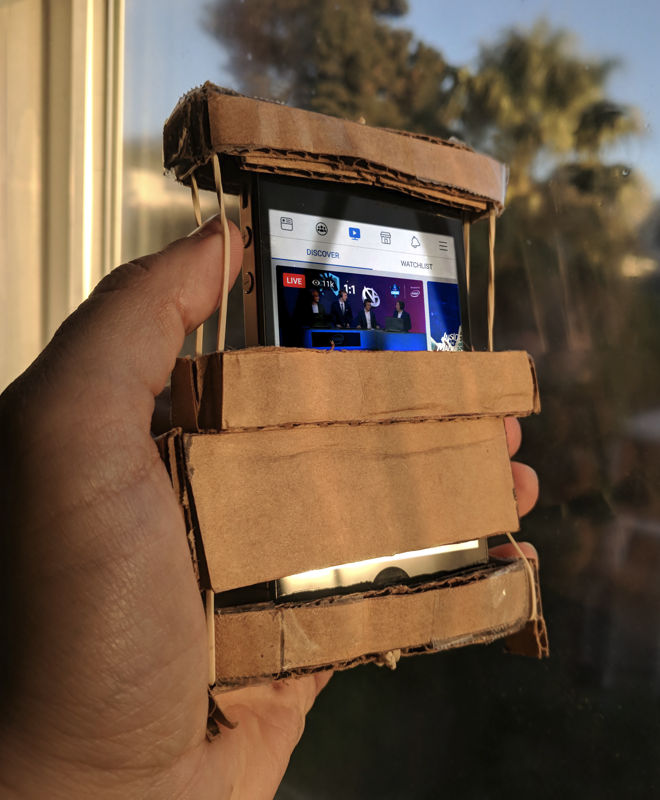
Prototyping doesn't always need to be digital! Siempo considered a feature to deter overuse of apps by blocking a small portion of the user's screen after a period of time. To test this idea, I could have created a software prototype, but I wanted to see test users respond in a real-world scenario such as browsing through one of their actual social-media accounts.
I crafted this physical prototype (image) in just a few hours, and made it able to stretch to fit any device. With Siempo Cardboard
I was able to swap in different sizes of screen blocking and to get user feedback faster and more accurately than with a digital mockup.
Of course, when appropriate, I have also created high-fidelity prototypes. You can tap on this example prototype (tap image) of Siempo's feature that allows users to type a personal intention
for themselves. Here, it was important to prototype the full visual experience including animations because the UX design of saving an intention needed to have emotional impact. I watched test users interact with the prototype and asked them if they felt that impact.
Despite being an MVP, Siempo Beta debuted in the Google Play Store to strongly positive reviews: I have tried tons of 'minimalist' launchers, this is the only one that has lived up to it's claim.
;
Cardpool Case Study
Background
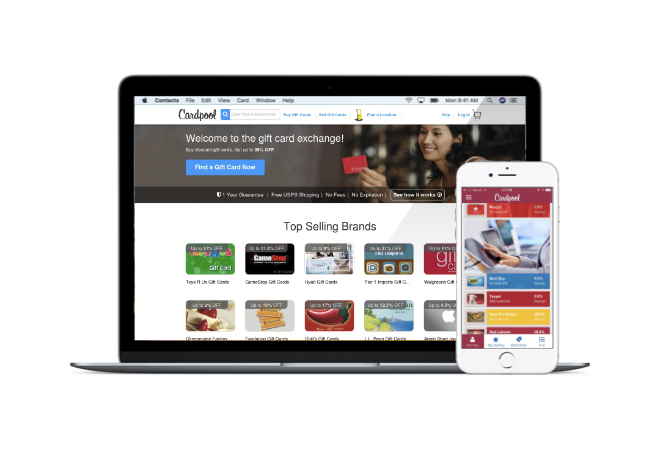
Cardpool is a dual-sided consumer market place where customers can sell unwanted plastic gift cards for cash and purchase pre-owned gift cards at a discount. As the sole UX designer, I created its first Cardpool mobile app, moving from sketchpad to app store in 7 months. The app earned a 4.5 star rating in the app store, was an Appy Awards finalist, and won PayBefore's Best Mobile App
in the payments technology category.
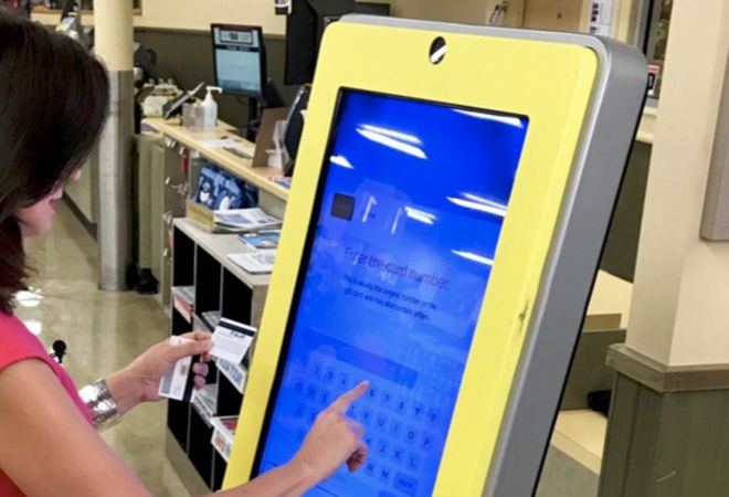
I also designed the complete overhaul of the Cardpool.com website, making it responsive to mobile devices, and I designed the interface of Cardpool's kiosks, in-store stand-alone machines that allow customers to exchange plastic gift cards for cash vouchers (hover over image).
Product Strategy
Opportunities for users on-the-go
My assignment was to increase sales and revenue by making Cardpool services available on mobile phones via native app and responsive web. I not only optimized and modernized the existing features for mobile-sized screens, I also created new features for mobile consumers that could deliver discounted gift cards, ready for immediate use, while they were waiting in the checkout line.
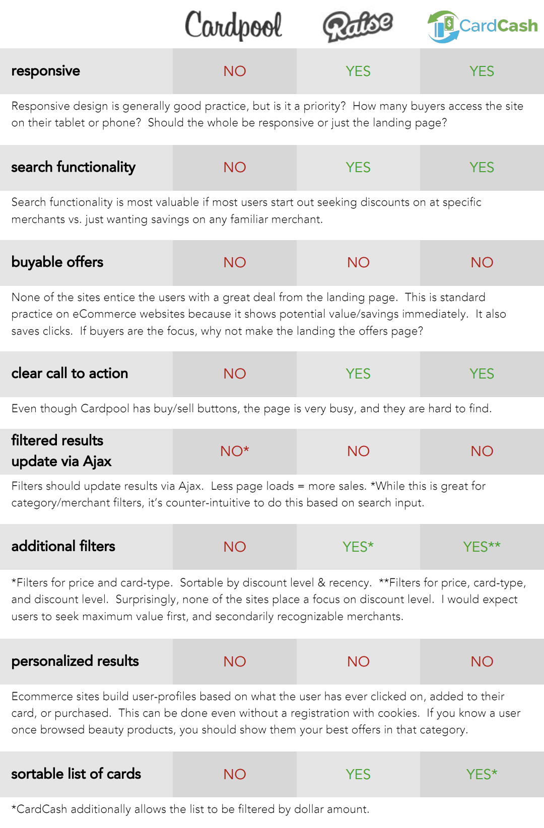
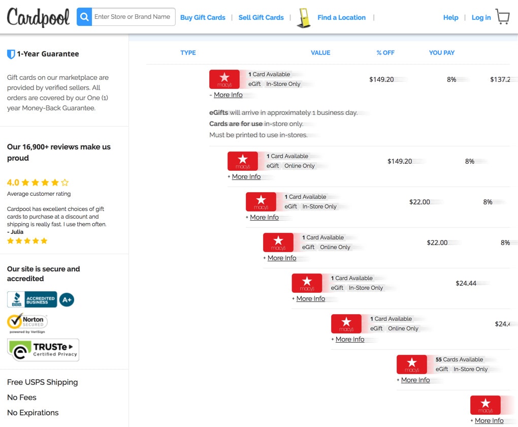
My first step to guide internal stakeholders was a thorough competitive analysis of the gift card space as well as an analysis of best practices from ecommerce apps (scroll image). Cardpool’s top competitor had the advantage of being first to market with their mobile app. However, that gave me the advantage of being able to dissected their app for ideas and flaws, and to read through public reviews to avoid pitfalls.
Unique security needs
My research surfaced the fact that the competitor had a strong checkout flow but lacked the strong security features that users required. Gift cards are inherently insecure and prone to fraud (you can think of them as branded cash
). Protecting users and the company required guiding buyers and sellers through several security hurdles including an SMS verified phone number. This led to researching the UX of banking and online wallet apps for approaches that made these hurdles more palatable, including a progress meter.
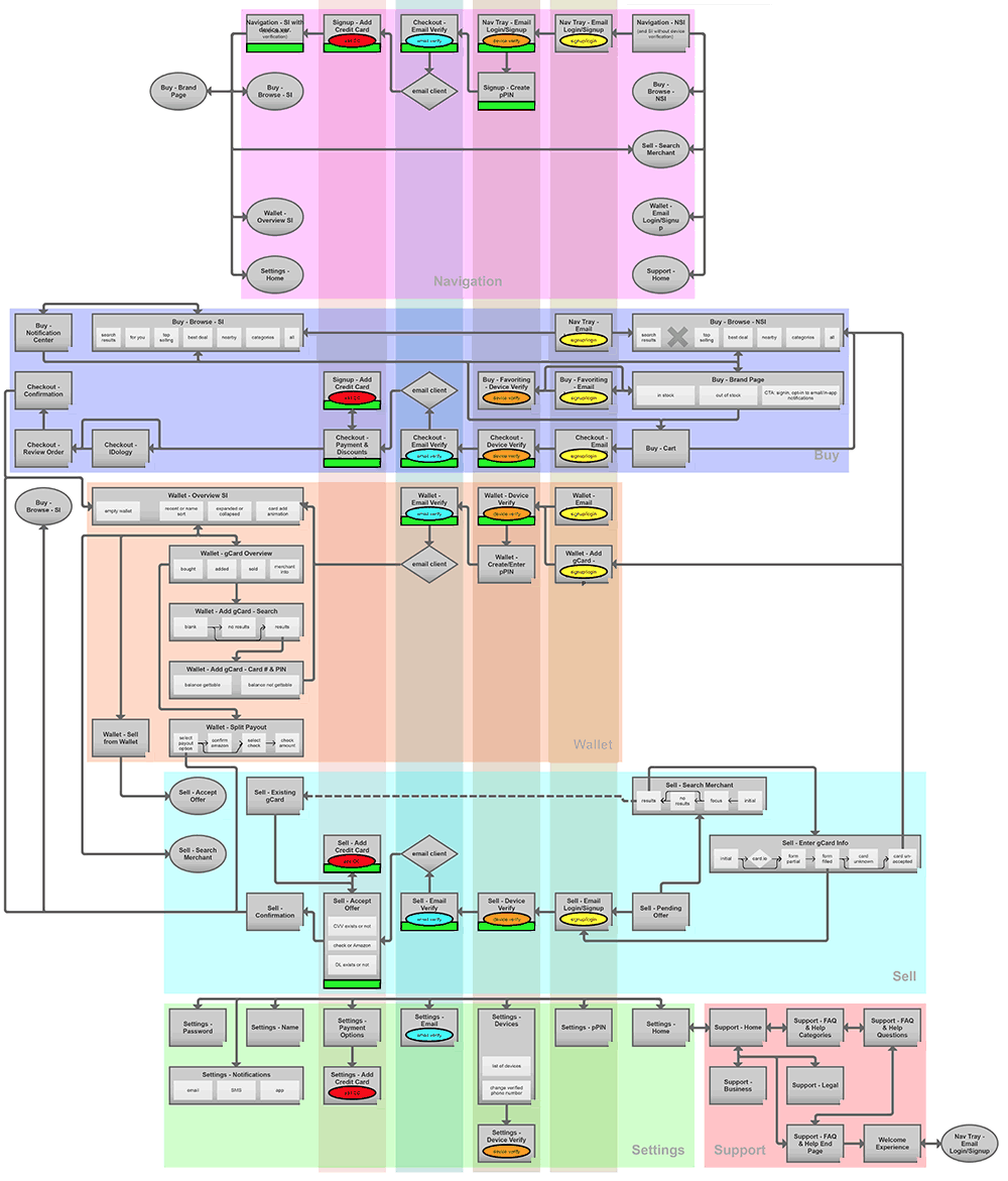
For a project of this size, I normally create an app map flowchart to ensure that all stakeholders understand the information architecture and to ensure that all corner cases have been uncovered. In this case, I also segregated the screens into the various levels of security needed to reach them (scroll image). These levels included, new visitors, new accounts, device verification, pin code protection, and banking credential verification.
UX Research
Before engineering began, I personally devised and conducted a week-long set of 90 minute usability interviews with 10 live subjects. I repeated this process for the redesign of the website. I modeled the entire mobile app and website as fully interactive prototypes that contained real inventory data with branding and prices. While we used a testing firm to provide facilities and moderation, I developed the tasks for the testing subjects, observed the interviews on-site, and wrote the report of findings. I conducted interviews by day, and by night I iterated the prototypes based on the feedback I observed.
Taking the time to use high-fidelity prototypes and real inventory data proved to be worth the expense. I discovered crucial insights such as how to better handle out-of-stock brands and the need to improve readability & accessibility with higher color-contrast.
Interaction Design
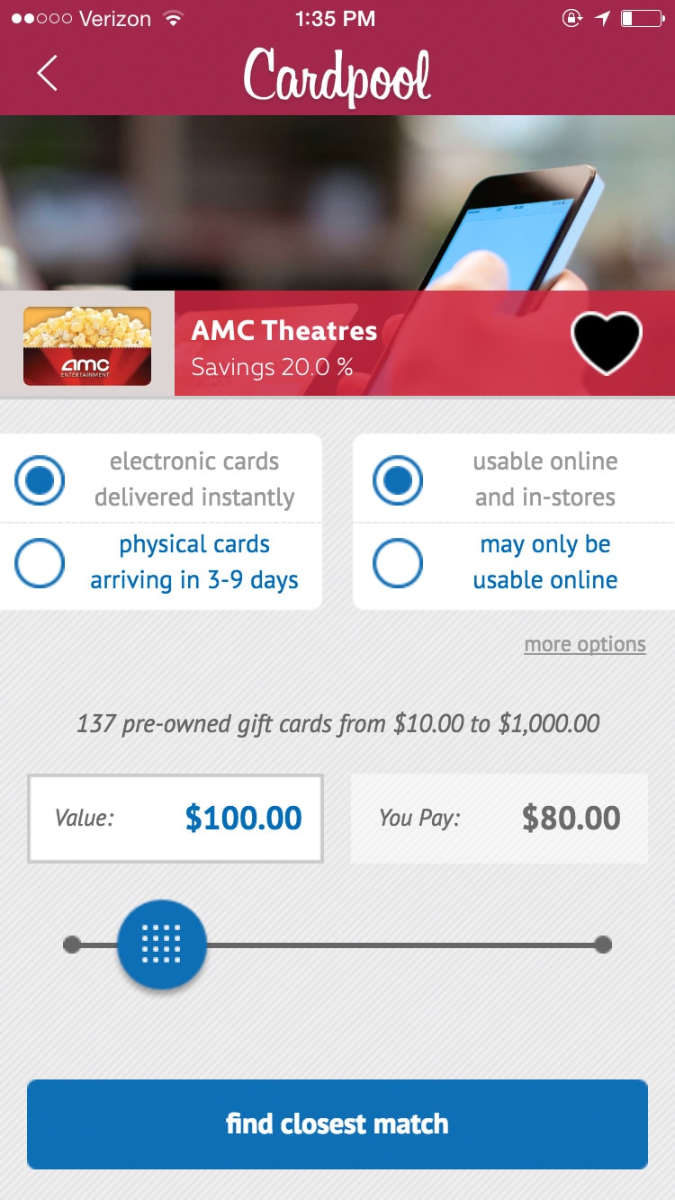
Introducing the pricing slider
One of my most effective UX innovations was introducing a slider tool that allowed users to select a total purchase amount. The slider was a brave choice because it was not used by specific competitors, nor is it common in ecommerce. But thorough usability testing proved that it would be popular. While its lack of accuracy as compared to typing in an amount generated some friction, it was successful because it gamified price selection and loosened users' preconceptions about their desired price (image).
When I moved to the website redesign project, I knew that the needs of desktop users at home or work were different from mobile users on-the-go. I prototyped a website version using slider as well as several other UX methods for filtering gift card inventory. The website usability testing revealed that, unlike mobile users, desktop users preferred to manually scroll though a long list of options than to use filters. Operating the slider with a mouse and track-pad didn't feel as fun as using their fingers, and desktop users found the inaccuracy unacceptable. Physical keyboards made typing a price easier, and our users at home were psychologically less flexible on price than our users in-store.
Optimizing the checkout funnel
My review of our internal metrics for the original website revealed that although many customers accessed the website from mobile devices, those devices had poor conversion to sales during the checkout funnel. I found specific pain-points in the funnel, which allowed me to make the case to the stakeholders for the need to budget for overhauling and standardizing our form fields and form validation.
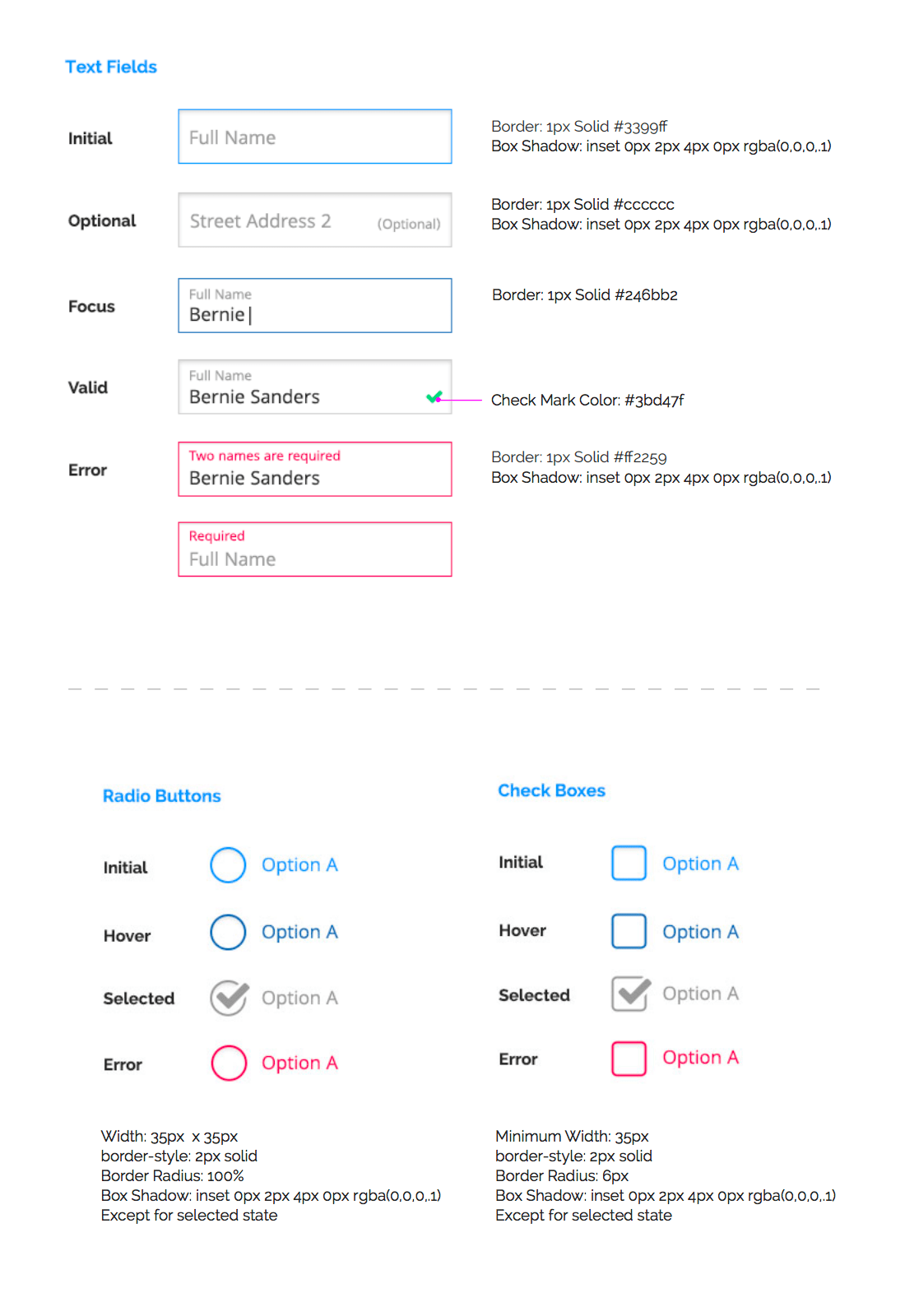
I devised and documented a detailed interaction model to handle form presentation that served to reduce the user error rate, boost user retries, and ultimately increase conversion to sales during checkout. Using the float label
standard employed by Material Design, these best-in-class form elements feature unique color states and animated transitions for hover, focus, valid, and error states. I also re-wrote micro-copy such as for errors to sound friendlier and provide more detail (scroll image).
Visual & Motion
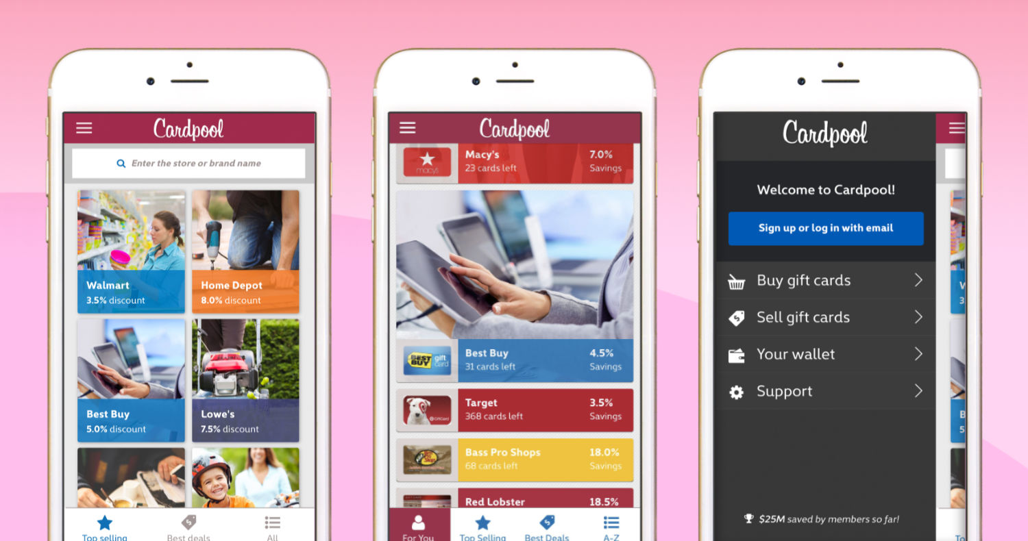
The launch of the mobile app and website coincided with a new visual design tailored to attract a wider audience. My design process began with the creation of marketing personas. These personas helped achieve consensus with stakeholders and allowed me to proceed with creating the visual style guide.
An internal marketing demographic survey revealed that 50% of the legacy user base was 45 and older, revealing the need to attracting younger consumers. I made recommendations for the use of lifestyle photography that exhibited a diverse set of models, use of currently fashionable website design elements, and moving away from the old-fashioned skeuomorphic design.
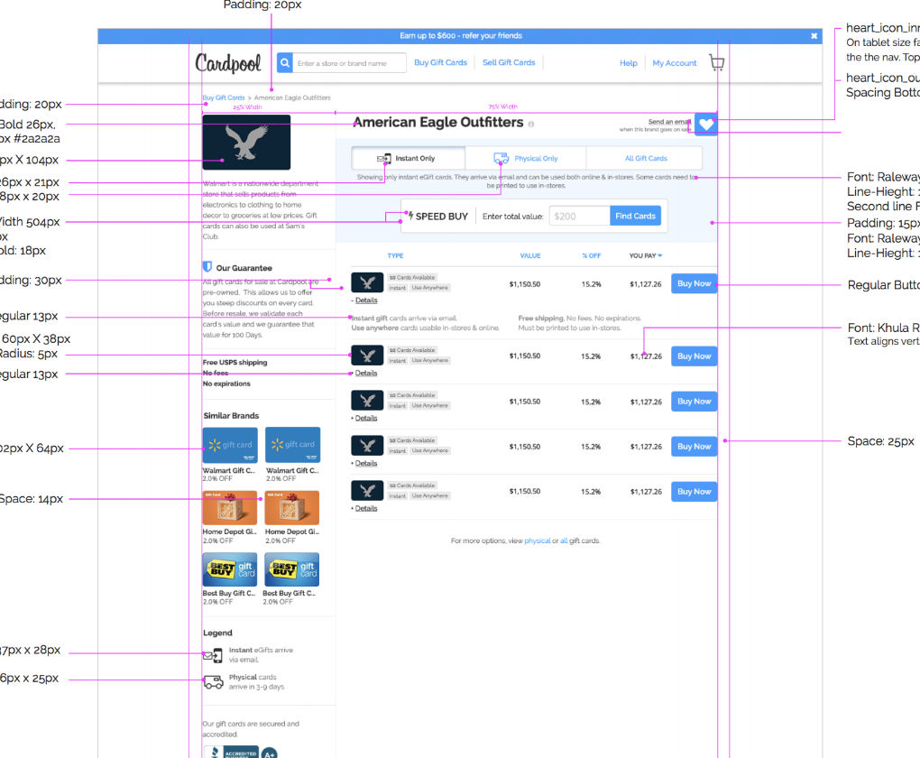
Because we used an off-shore engineering team, I also delivered pixel-perfect mockups and extensive UX documentation including the details of micro-interactions, transitions & animations, error states, and micro-copy. The complete style guide also included typography, color, and layout details (hover over image).
Where budget allowed, I argued for the live site to incorporate transitions & animations to add to user delight. Even subtle animations such as 50 millisecond hover effects produce the unconscious sensation of polish and modernity. I also created more dramatic transitions, such as with the presentation of the gift card inventory list. The cards slide from off-screen to their resting position using a staggered animation effect, and in usability testing of this effect, users reported excitement and increased attention (hover over image).
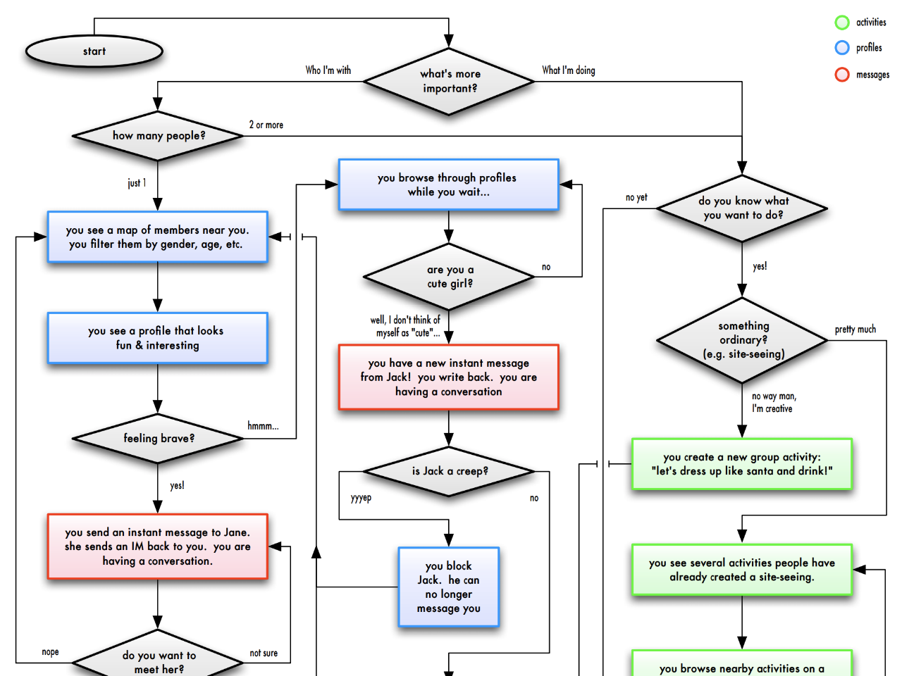
CouchSurfing Startup Journey
Introduction
CouchSurfing.com pioneered homeshare and the sharing economy
. It preceded AirBnb, TaskRabbit, and Lyft, and it has sometimes been called the free AirBnb
or the platonic dating site
. I was the 2nd full-time employee, and I built the startup over five years until we acquired $21 million in venture capital funding. I helped create many of its software tools and employee processes for rating the trust between sharing-community members. Those tools were later duplicated and improved by the other sharing economy websites.
I joined CouchSurfing three years after its public launch in 2004. I helped select and hire almost every employee who followed me, growing the company by 45 more people, and building the product department from the ground up as its Head of Product Design. I co-designed the first CouchSurfing mobile app, and managed two product designers and a researcher.
Product Strategy
In collaboration with my talented team members, I product managed and launched CouchSurfing's first iOS mobile app, optimized the purchase funnel to greatly increase revenue, created the product design and UX for the casual mobile meet-ups tool, created new strategies for our user matching algorithm, oversaw our first re-branding effort, and designed internal tools for user safety and customer support.
Creating a matching algorithm
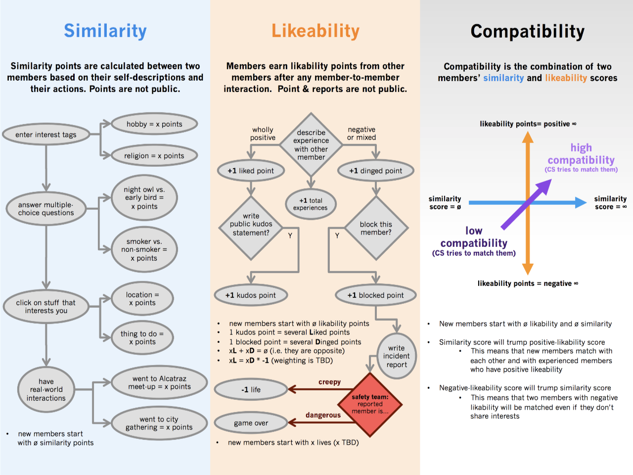
CouchSurfing is a dual sided marketplace
, with times of unequal supply and demand in different parts of the world and in different seasons. I studied multiple solutions to improve our matching algorithm taking into account these market dynamics and user behavior. Unlike AirBnb, a host's location and amenities were not driving factors for matching. Also, unlike romantic dating sites which are optimized for worse matches due to the fact the successful matches lead to lower revenue, successful matches on CouchSurfing led to higher revenue. CouchSurfing was, and still is, a one-of-a-kind laboratory for quantifying human interaction. (hover over image)
Expanding the product suite
The couch
was just one of the potential venues for face-to-face experiences between to members. CouchSuring.com initially launched with only this one venue, which was also its name-sake. It then expanded to organized formal events. I led the creation of our third venue: our casual mobile meet-ups product suite. This expansion allowed any number of members to spontaneously gather around any place of interest or any activity. It has yet to be duplicated successfully on any other website. (hover over image)
I helped optimize CouchSurfing for the greatest number of face-to-face meetings between members. By expanding the venues for such meetings beyond the couch
and from 2-people to groups, I increased active users, user retention, and the network effect that those create in turn.
UX Research
One of the many initiatives I led over the years was the overhaul of the search results list that members used to search for other members to meet. This page represented the start of the funnel that led to a face-to-face interaction. In order to improve this page, I conducted several individual user interviews, analyzed the page's heat-map for thousands of users, and conducted quantitative research. (hover over image)
Discovering the right KPI
I conducted quantitative research continuously to optimize product funnels and measure the success of each iteration. By wading through vast amounts of data, I discovered that the greatest driver of active users and therefore the most vital KPI for generating network-effect was when a member met another member face-to-face for the first time.
That first face-to-face interaction predicted a valuable member who would go on to propagate many further face-to-face interactions with other members via hosting or staying with them. With this knowledge, I was able to evaluate the success of every product iteration by its impact on that single KPI or by a faster proxy for that KPI.
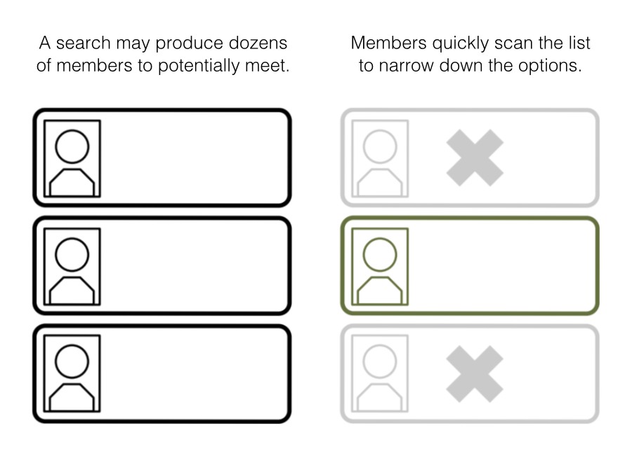
Dissecting user behavior
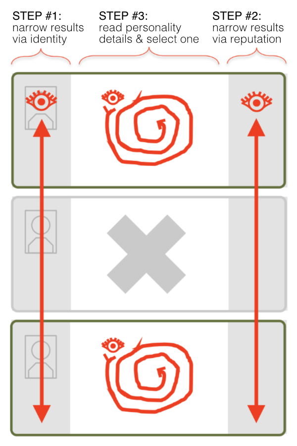
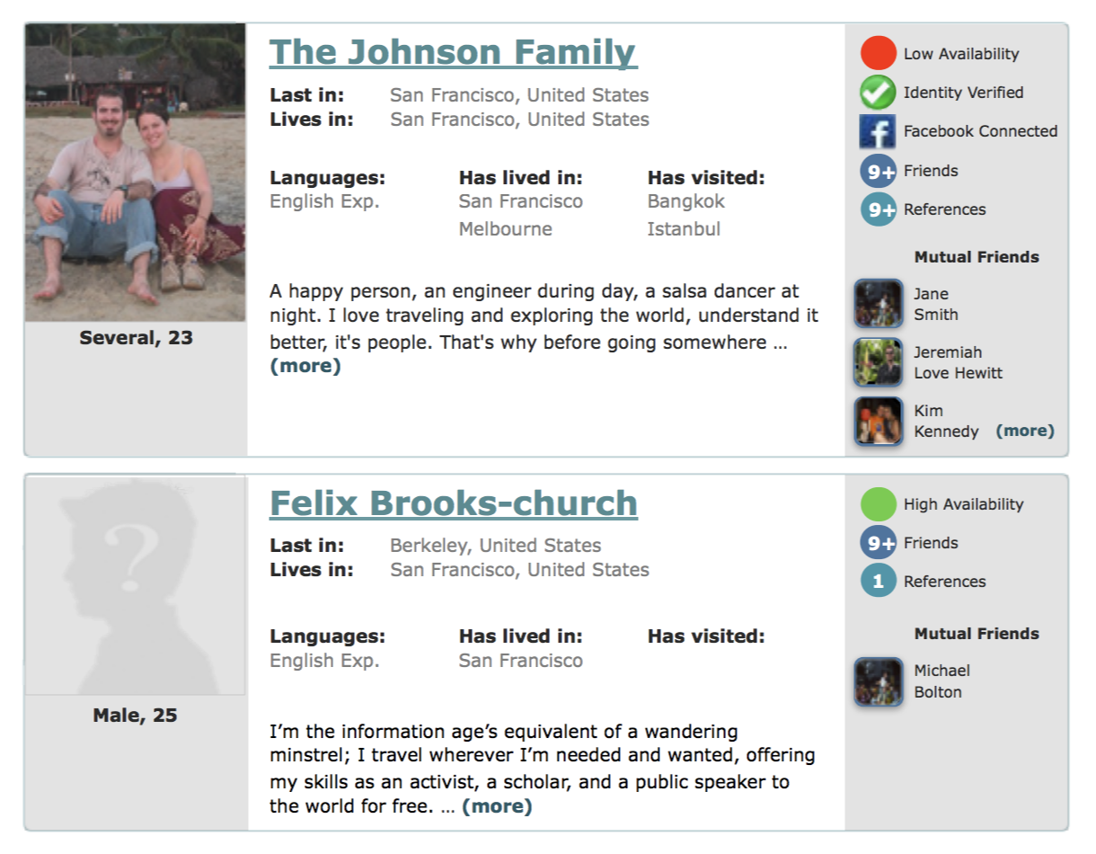
Through interviews and heat-map analysis, I uncovered the criteria that traveling members used to narrow down the search results before clicking through to view an individual host's profile. I used that research to visual restructure the information within each search result. (image)
The most important factor was a host's availability & likelihood to host. We used this primary factor to sort the search results, placing our prediction for most-likely-to-host at the top. The 2nd-most important factor for narrowing the results was basic identity as determined by the host's as age, gender, and photo. The 3rd ranking factor was reputation rating, and the final factor was personality details including common interests. We designed the new visual layout of search results to accommodate this ranking.
Implementing the results
Knowing that travelers essentially used a three-step process to select one host to to view in more detail, I reorganized the information for each search result into three columns. I conducted further usability tests with this prototype layout, which confirmed that members could easily visually scan the left and right columns for the information they most valued in order to narrow down the results. (image)
The restructuring and new information architecture allowed travelers to move from the search results list to the host's profile pages with greater speed and accuracy. This in turn resulted in travelers sending messages to members who were more likely to host, which in turn led to an increase in our primary KPI: a successful face-to-face meeting between members. I was able to track results across this funnel via A/B testing the product roll-out.
About Me

I've been designing & building software products since 2000, and there's always more to learn as technology and best practices evolve. I've worked on the evolutions brought by web 2.0, mobile, social, and most recently AI. I studied hand drawn animation in college, and I'm still passionate about the art of motion, film, and storytelling. I'm happily based in San Francisco.
Joseph Brauer